The Shadow Over Innsmouth (Heavenly Monkey)
CharlasFine Press Forum
Únete a LibraryThing para publicar.
1opto4
Here are some photos of The Shadow Over Innsmouth from Heavenly Monkey. I have both the Batrachian and the Ichthyic editions.
These photos are of the Ichthyic edition. Not the easiest book to photograph.
This is the description from the Heavenly Monkey website:
"Ichthyic (25 copies, I-XXV, with the imprint Heavenly Monkey) printed on Nideggen, a laid sheet suitably tinted for the story's abyssal theme. These were hand-bound at the Heavenly Monkey studio: sewn on black vellum slips and laced into a traditional limp case made from a handmade abaca-based paper with the texture and look of vellum. The case is lined with a sheet of handmade cotton paper that has had a large linocut printed on the front, the title on the spine, and our press device on the back. These can be seen through the semi-transparent paper case, to greater or lesser degrees, depending on how it is held. This issue also includes proofs of the engravings printed from the original blocks on handmade gampi paper, interleaved through the text, with the colophon signed by Shinsuke Minegishi. Seven of these copies (two hors commerce) had the proofs hand colored by the artist; these were sewn on purple vellum slips. With a black paper slipcase on which the title and lincout have been printed in black."
I have copy X, which is not one of the editions with hand coloring.
Please note that I did lighten the photos a bit so that you could see things slightly better. The color of the paper might actually be slightly darker than it appears here.
The book comes double-cased in two paper cases, one purple and one black. The black case has the same artwork and lettering that's on the cover of the book, as described above. Haven't been able to get a good photo of that yet. Best I can do right now is a close-up shot of the book in both of its cases. It's a bit awkward, both hopefully it coveys how it's all put together:

After the book has been removed from the cases, you can get a good look at the front, spine, and back. You can see the outer semi-transparent wrapper, with the artwork, lettering, and logo all underneath:


A view from the top:

The title page has the same fold out map in both editions

Chapters are separated by the proofs printed on gampi. Here's a shot of a proof page before chapter 3 and then the page underneath.


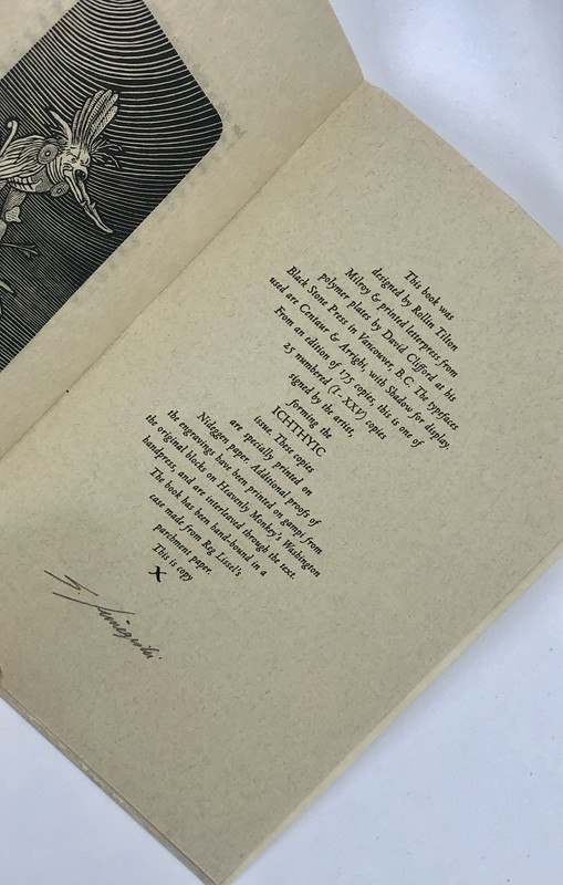
The colophon:
These photos are of the Ichthyic edition. Not the easiest book to photograph.
This is the description from the Heavenly Monkey website:
"Ichthyic (25 copies, I-XXV, with the imprint Heavenly Monkey) printed on Nideggen, a laid sheet suitably tinted for the story's abyssal theme. These were hand-bound at the Heavenly Monkey studio: sewn on black vellum slips and laced into a traditional limp case made from a handmade abaca-based paper with the texture and look of vellum. The case is lined with a sheet of handmade cotton paper that has had a large linocut printed on the front, the title on the spine, and our press device on the back. These can be seen through the semi-transparent paper case, to greater or lesser degrees, depending on how it is held. This issue also includes proofs of the engravings printed from the original blocks on handmade gampi paper, interleaved through the text, with the colophon signed by Shinsuke Minegishi. Seven of these copies (two hors commerce) had the proofs hand colored by the artist; these were sewn on purple vellum slips. With a black paper slipcase on which the title and lincout have been printed in black."
I have copy X, which is not one of the editions with hand coloring.
Please note that I did lighten the photos a bit so that you could see things slightly better. The color of the paper might actually be slightly darker than it appears here.
The book comes double-cased in two paper cases, one purple and one black. The black case has the same artwork and lettering that's on the cover of the book, as described above. Haven't been able to get a good photo of that yet. Best I can do right now is a close-up shot of the book in both of its cases. It's a bit awkward, both hopefully it coveys how it's all put together:

After the book has been removed from the cases, you can get a good look at the front, spine, and back. You can see the outer semi-transparent wrapper, with the artwork, lettering, and logo all underneath:


A view from the top:

The title page has the same fold out map in both editions

Chapters are separated by the proofs printed on gampi. Here's a shot of a proof page before chapter 3 and then the page underneath.


The colophon:

4elenchus
Fitting for the story, and artisanal work. Wasn't aware of that edition, thanks for sharing!
7astropi
I have the regular edition. The paper is not as nice, although I do actually prefer the black cloth cover. Otherwise, it's the exact same text. All editions are 5 x 7.5 inches, so rather small. I really wish they had made the edition larger and more luxurious - a missed opportunity. The illustrations are lovely and fitting Lovecraft, but not really fitting the work in my opinion (one can argue). In terms of letterpress Lovecraft, well it's still a lovely book. I just wouldn't put it on the same category as Colour out of Space. Also, the Pegana Press Dark Dreamlands is more beautiful, but very pricey. All that said, without doubt this is something a Lovecraft or fine press collector would certainly want. A few years ago I saw a few for sale (much more than the original cost), but those are now all sold -- so it's interesting that for whatever reason this book has tremendously increased in popularity/price over the past few years.
8kermaier
>7 astropi:
Agreed, HMP could've gone bigger and richer, and still sold out the edition pretty quickly.
Agreed, HMP could've gone bigger and richer, and still sold out the edition pretty quickly.

