1punkzip
What is the difference between the different FS editions of Middlemarch? Trying to decide between spending $125 on the latest edition vs. buying an earlier edition used on the secondary market. How much better is the latest version?
2Willoyd
That's a complicated one! It, of course, partly depends on what you mean by 'better'!
Essentially, there have been 3 iterations of Middlemarch (I hope I've got this all right - there are others who will put me right if not!):
1. First issued in 1972 in a red silk binding with oval picture on the front (1A). This was reissued a couple of times in the 90s, at least once in a different, pale blue 'elephant hide' (actually vegetable parchment) binding (1B). Illustrated with 28 drawings by Robin Jacques, introduction by Kingsley Hart, 23cm x 15cm.
2. First issued as part of a full set of George Eliot novels in 1999, in a uniform style binding of varying colours, dark blue in this case, with a portrait 'vignette' on the front cover, and 24 B&W engravings by Simon Brett (2A). Introduction by Penelope Fitzgerald. This was subsequently issued as a separate individual volume, in a purple crushed silk binding, with no vignette (2B). Size also 23cm x 15cm.
3. The current edition, as shown on the website. 15 colour illustrations by Pierre Mornet, introduction by John Mullan. Size 28cm x 18cm.
I have at various times owned copies of 1B (my current copy), 2A and 2B. I've handled copies of 1A and 3. Middlemarch is one of my all-time favourite novels, so a really nice copy is a priority!
These numbers reflect, IMO, a tendency of the FS in recent years to increase the sizes versus decreasingthe number of illustrations, although the last has, for some, the advantage of colour.
Of those, my favourite copies are 1B and, marginally less so, 2B. I sold off my set of Eliot novels (inc 2A) a year or so ago because I found the covers ugly - those vignettes used to drive me mad! (I now have a complete set of early 20th century Collins Clear Type Press pocket editions including a 2-volume Middlemarch - take up far less space, pleasantly attractive in a used book sort of way, and with a surprisingly readable print). I found 2B very attractive - the crushed silk was perfect - but the spine label is a tiny bit clunky for me, and Simon Brett's wood engravings didn't quite do the business compared to the line drawings by Robin Jacques in 1B - they're good, but second of the two. I didn't particularly go for the binding of 1A - and it's very hard to find one that doesn't look very worn nowadays - but 1B fitted the slot perfectly. A bit understated for some perhaps, but for me simply elegant, with the advantage of being the most profusely illustrated iteration, with the best suited of the three illustrators (IMO). It's a production I really like. Others might say it's rather ordinary, but that probably suits my style - I prefer 'simple'!
There is no doubt that the most recent edition is the most luxurious. However, personally, compared to 2B, it simply doesn't stack up: the green cover is too lurid (I'm not a fan of the cover art either, but I don't positively dislike it), the illustrations look stilted, there's little advantage with colour (for me, Victorian classics are fine in B&W!), and it's a more awkward size to read (this is a book I visit a lot). Finally, 2B cost me £15 for a pristine copy. All in all, a no-brainer.
But that's very much personal taste. Hopefully, you'll be able to use the objective information to help with your decision, and my opinions to help you develop yours (even if completely the opposite!). Whatever decision you come to, it's certainly a magnificent book, and worth having a copy that you delight in yourself; I hope you reach a happy conclusion, and look forward to any report on the outcome!
3ASheppard
I have the '94 reissue of Middlemarch, (Kingsley Hart intro with full page b&w drawings by Robin Jacques), which has the pale blue parchment boards. I think it is a quite a lovely foil to the only other FS Eliot volume I have, Mill on the Floss, a 2008 re-issue, crushed art silk boards in turquoise, engravings by Ian Stephens.
4dlphcoracl
>1 punkzip:
Don't outthink this.
The current edition of Middlemarch with illustrations by Pierre Mornet (2018), still available directly from the Folio Society, is a deluxe edition and it is stunning, one of the best non-LE FS publications over the past several years. It was typeset at the Folio Society in Caslon, a very clean and legible type, printed on Abbey Wove paper at L.E.G.O. S.p.A., Vicenza, Italy (near Verona and Venice) and bound by them in a very fine cloth blocked with a design of a Victorian woman by the artist on the front cover. Note that L.E.G.O. S.p.A - along with the German duos of Memminger/Josef Spinner and previously Memminger/Lachenmeier - is one of the very finest of the many workshops the FS editions are outsourced to.
It is more expensive than earlier FS editions and it should be. The price of 79.95 GBP or $125 US dollars is very fair for the quality of this edition. Buy it before it goes OOP because it already sells for a premium in the secondary market (even ignoring the ubiquitous gougers at Island Books) and the price will only increase further when it does.
5gmacaree
>4 dlphcoracl: correct
6abysswalker
>4 dlphcoracl: it is true that the build quality is on the upper end of Folio Society non-limited editions for the 2018 release, but personally I much prefer both the binding design and the Simon Brett engravings in the 1999 edition compared to the binding and illustrations of the current offering. The 1999 edition was printed by the Bath press on Balmoral Wove. The lime green cover of the 2018 release makes me think of appliances from the 1950s.
I agree with the Oracle on likely future pricing (though you never know; they might keep issuing additional printings).
I don't have easy access to my copy of the 1999 edition at the moment, but here is one of the illustrations from the Barbarian Press Endgrain Editions volume on Simon Brett:
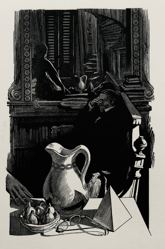
(This is a finer printing, but the illustrations in the Folio Society edition are nicely done as well.)

I am also a huge fan of Brett though.
7whytewolf1
>2 Willoyd: Thanks for taking the time to compare and contrast the various editions. Just to add a tidbit to your opus here, your 2B seems to be the 2007 reissue of the 1999 edition, just to clarify for anyone interested.
8whytewolf1
>6 abysswalker: Thanks for posting. Simon Brett's work does look lovely.
9cronshaw
I too am a fan of the 2008 crushed silk boards edition with Simon Brett's evocative wood engravings. I wasn't taken with the latest oversized FS edition (11" tall) finding it too large for comfortable reading, and not caring for the comparatively stilted illustrations. I wouldn't give too much weight to the fact that there are unscrupulous sellers on eBay currently selling it for more than the current FS price; that applies to most titles still stocked by FS these days.
10kdweber
>6 abysswalker:. My only copy of Middlemarch is the FS 1999 edition. Though I like the Brett illustrations I don’t like the bindings on this Eliot set. I satisfy my Brett craving by perusing my copy of the Barbarian Press endgrain edition.

12abysswalker
>11 cpg: I have to agree with you there. I had somehow blotted this one from my memory. Most of the others are excellent! Now I want to page through my FS edition again. I have been spoiled by the Barbarian volume.

