1astropi
We all find errors in books, from time to time. Sometimes a spelling error, sometimes something more serous. What are some noticeable errors you've encountered in your fine press books? So, this is a book I do NOT have, but the error made me laugh. I love the Allen Press, they are among my favorite presses and are rightfully regarded as one of the greatest fine presses of all time. But hey, no one's perfect... can you spot it? :)


2kdweber
>1 astropi: I don't see any problems or typos except that the Hebrew at the top is upside down.
3astropi
>2 kdweber: yeah, I consider that a major "typo"! Hebrew is read right to left, but NOT upside down :)
4U_238
>2 kdweber: Seems like a pretty big problem.
5kermaier
Even worse, the Hebrew is a tossed salad of mismatched verses and phrases from the Ten Commandments — not from the Book of Ruth at all!
6astropi
>5 kermaier: There actually is a relationship between the Ten Commandments and the Book of Ruth. They are both associated with the holiday of Shavuot, although you're right that the whole way that was done makes it seem like they really are a bit clueless :)
7elladan0891
>2 kdweber: >5 kermaier: The Allens loved using non-Latin alphabets and scripts decoratively creating pleasant visual aesthetics - unless you know the language. I've seen pictures of their Pushkin book, which looks absolutely wonderful, except the "Russian words" at the tops of the pages are neither Russian nor words - just a random mishmash of cyrillic letters. The only "logic" I could see is they mostly picked letters that are different from the Latin ones, presumably to enhance the exotic effect. Looks very jarring and silly. Fortunately, I don't buy Russian books in English so I never intended to acquire the book and can't complain about a spoiled purchase. However, knowing they did that has been giving me second thoughts about Persian Tales from Arabian Nights and the Thomas Mann. On one hand, I don't speak the languages, have no idea what the Allens printed there, and find the decorative use of the scripts very pleasing. On the other hand, knowing that most likely some random rubbish is printed has been giving me second thoughts. Discovering from you that Hebrew is messed up too just serves as another confirmation. However, I will probably plea ignorance eventually and go for the Mann (and maybe the Arabian Nights too).
8kermaier
>7 elladan0891:
I have Mann's "The Transposed Heads" from the Allen Press -- my Sanskrit is rusty ;) so I wasn't aware that it's probably meaningless decoration. Now that I know, it's slightly annoying (I mean, how hard could it be to find some actual relevant text to copy??), but not a deal-breaker. The Hebrew rubbish on "Ruth" would be an insurmountable obstacle to my enjoyment, as it's immediately apparent to me.
>6 astropi:
Yes, good point about the association between Ruth and the Ten Commandments, as both are read during the Jewish holiday of Shavuot (generally known as Pentecost, to English-speaking non-Jews). If only they'd actually used correct passages from the Ten Commandments, rather than the word-salad shown above, I'd have given them a pass -- but this is really too pitiful for me to accept. Again, how hard could it be to get a Hebrew/English edition of the Bible, for cryin' out loud....
9U_238
Reminds me of the people getting Japanese and Chinese tattoos, ostensibly saying profound things, but literally translating to random things like "chicken noodle soup" and "sweet and sour chicken."
10abysswalker
>9 U_238: I was thinking exactly the same thing! It goes both ways of course; I’ve seen English tattoos in East Asia that are semantically challenged in a similar manner.
11elladan0891
>8 kermaier: Well, I guess we could still nurse some hope that although the supposedly Russian and Hebrew texts are rubbish, Sanskrit might be proper )

13elenchus
>1 astropi:
I don't read Hebrew so didn't spot that major error.
There's also a missing space in the fourth line of English text:
So, between the words "country" and "he" (or so it appears in the image). I expect the kerning is variable for this, but that still looks small for a full space.
I don't read Hebrew so didn't spot that major error.
There's also a missing space in the fourth line of English text:
... in the Moabite country,he and his wife ...
So, between the words "country" and "he" (or so it appears in the image). I expect the kerning is variable for this, but that still looks small for a full space.
14astropi
>13 elenchus: the spacing looks normal to my eyes at least
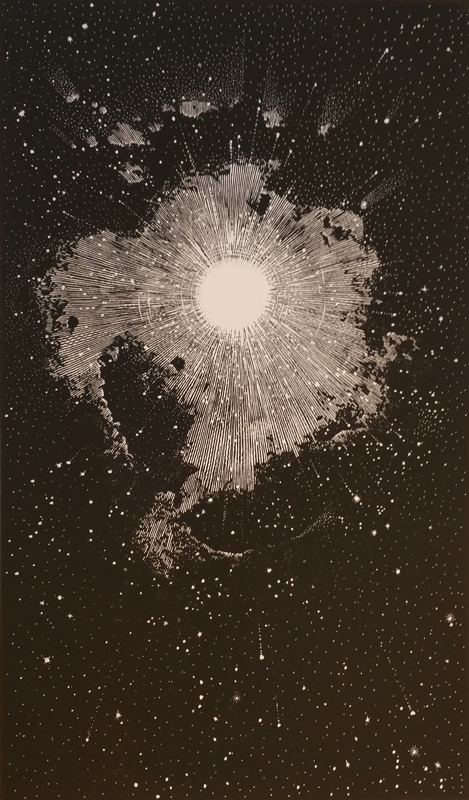
15filox
>1 astropi: I like the RUTH font though. Apparently it's called Solemnis, haven't heard of it before tbh.
16kermaier
>12 astropi:
Heheheh -- that's a bad beat, and no mistake!
Pretty sure that's a Photoshop job, though -- you can see fringing around the letters when you magnify a bit.
Heheheh -- that's a bad beat, and no mistake!
Pretty sure that's a Photoshop job, though -- you can see fringing around the letters when you magnify a bit.
17astropi
>16 kermaier: Supposedly it was from an Israeli who lives in the USA and saw a soldier with that tattoo and posted on facebook about it. Sounds legit, but I never followed up :)
18kermaier
>13 elenchus:
That spacing issue is quite minor, as these things go. The Allen Press "Rappaccini's Daughter" is riddled with typos great and small -- missing spaces, misspellings, stray apostrophes and semicolons, doubled words, the odd upside-down question mark -- as well as an untitled, unattributed (and oddly written) "essay" at the beginning of the book.
That spacing issue is quite minor, as these things go. The Allen Press "Rappaccini's Daughter" is riddled with typos great and small -- missing spaces, misspellings, stray apostrophes and semicolons, doubled words, the odd upside-down question mark -- as well as an untitled, unattributed (and oddly written) "essay" at the beginning of the book.
19kermaier
Couple of funny errors in the Officina Athelstane edition of Swift's "A Modest Proposal" -- see if you can spot 'em:


20DenimDan
>15 filox: The Allens used Solemnis several times, usually for titling: for Christopher Columbus (1972), Antigone (1978), and the Oresteia (1982). It's a peculiar uncial, although I think it looks best here paired with van Krimpen's beautiful Romanee. In the Oresteia, they used Solemnis for titling and Menhart Unciala for the lines. It's a bit of an uncial overload for those who don't love the style as much as the Allens did.
I do wonder whether the other languages in the text suffered a similar fate! I can't say, as I don't know Sumerian and the language of the Jacobites. Honestly, I doubt I would have ever known that the Hebrew was misprinted.
I do wonder whether the other languages in the text suffered a similar fate! I can't say, as I don't know Sumerian and the language of the Jacobites. Honestly, I doubt I would have ever known that the Hebrew was misprinted.
21jveezer
Interesting discussion that got me thinking about the Yoga Sutra, a text I would love to see a private press edition of. I have many editions, and prefer ones that have the Devangari script, the transliteration, and the translation. The Devangari is a beautiful script I would be very annoyed if there were mistakes in any of that IF I was using it for self-study and learning the script, transliteration, and translation, instead of just absorbing the wisdom in the language I read fluently. This is not as annoying and more excusable than the fact that Proust's second volume of his life work is somehow still known widely as Within a Budding Grove when even my 7th grade French knowledge can translate it more accurately.
It would seem a good idea for a printer to put in a disclaimer if they are not proficient in a language and are not going to have a text editor go over that part. I would not have known that the Hebrew was problematic but am quite happy it is there. Now I can't unknow it but I am still happy it is there and would still acquire this book for its beauty, its English content, and its press work.
It would seem a good idea for a printer to put in a disclaimer if they are not proficient in a language and are not going to have a text editor go over that part. I would not have known that the Hebrew was problematic but am quite happy it is there. Now I can't unknow it but I am still happy it is there and would still acquire this book for its beauty, its English content, and its press work.
22DenimDan
>21 jveezer: I agree that despite its flaws, this is still a beautiful later book of the Allen Press. I think sometimes they got a little too cute with these kinds of headers at the top of pages and it doesn't always work out (even when the text isn't upside down). I'm a bit overwhelmed by this method in their Oresteia, for example. However, in their Genesis (1970), I think the same tactic is used very appropriately.
OT: Looking around, it appears one can get a very nice copy of this book for well under $400, which is not nothing, but it's still a heck of a deal. I think this is true of many of their books, considering the quality of materials and the skill involved. Some of their early, non hand-press books show their workmanship well too. Their Essays of Montaigne (1948) comes to mind as one of their best earlier productions.
OT: Looking around, it appears one can get a very nice copy of this book for well under $400, which is not nothing, but it's still a heck of a deal. I think this is true of many of their books, considering the quality of materials and the skill involved. Some of their early, non hand-press books show their workmanship well too. Their Essays of Montaigne (1948) comes to mind as one of their best earlier productions.
23elenchus
>19 kermaier: couple of funny errors
1- prolifick Dyet ... Roman Catholic Countriesk
2- the most convenient Pants
The latter I laughed at, the former is perhaps not what you had in mind: the stray k's are errors but not particularly amusing, and I think prolifick might even be an acceptable spelling for the age.
I did raise an eyebrow at Swift's conviction that "a Child just born will weigh Twelve Pounds". My condolences to the mother.
24Glacierman
>23 elenchus: ". . . and I think prolifick might even be an acceptable spelling for the age."
You are quite correct in so thinking.
You are quite correct in so thinking.
25ultrarightist
>23 elenchus: and >24 Glacierman: He spelled in a publick and prolifick manner.
26kermaier
>23 elenchus:
Right, it’s just “countriesk” there. Reminds me of Popeye the Sailor — “so embarraskin’”.
And yes, I imagine convenient pants are the ones with the fly in front. :-)
Right, it’s just “countriesk” there. Reminds me of Popeye the Sailor — “so embarraskin’”.
And yes, I imagine convenient pants are the ones with the fly in front. :-)
27dpbbooks
>23 elenchus: My daughter did weigh 12.5 pounds at birth (a hospital record). And her mother was a trouper. My daughter is now in late pregnancy and is sincerely hoping that history does not repeat itself. ;-)
28kdweber
>22 DenimDan: Yes, my copy cost less than $250. Well worth it even with the upside down Hebrew. I showed it to my wife this evening and the first thing she said is why is the Hebrew upside down. Sadly, I didn't even notice the first time I read it through.
29mnmcdwl
Though the Allen Press was operating in a very different time, I could never imagine publishing anything in a language you can’t read yourself (or know someone who can). I can read Japanese, and the number of Japanese mistakes in Anglophone countries and English mistakes in Japan is absurd. In Japan, English mistakes are more often because they are written for native Japanese ascetic eyes and ears—with a (nearly) homogeneous population, sensitivities of native English speakers count for little. I imagine Japanese mistakes in Anglophone counties are for similar reasons. I love translation and seeing side by side versions of works, and so egregious mistakes like this are a turnoff.
>21 jveezer: Count me among those who would be very interested in a bilingual version of the Yoga Sutra. If a fine press were to take it up in this day and age though, I should really hope they would have someone to proofread the Devanagari.
>21 jveezer: Count me among those who would be very interested in a bilingual version of the Yoga Sutra. If a fine press were to take it up in this day and age though, I should really hope they would have someone to proofread the Devanagari.
30ultrarightist
>29 mnmcdwl: It's decorative text, not a translation. Significant, yes, but I would not say it is egregious.
31astropi
>30 ultrarightist: I think it's pretty bad. Bad enough to keep me at any rate from purchasing it. Imagine you were purchasing some sort of fine press book, which of course is by definition expensive, and say it had a quote by a favorite author, but that quote was upside down! I bet you would think to yourself "What the? this is so amateurish! How could they let this happen?" Well, that's rather the view I have of this work, and for the record, I love the Allen Press!
32venkysuniverse
>21 jveezer: The god have listened and an Indian press has printed what I believe the most beautiful edition of YogaSutra that I have laid my eyes on. I have a copy and can vouch for the quality of the paper, printing, binding and the overall presentation. It also arrives with a gorgeous Wooden stand.The wooden solander box is of outstanding quality and very elaborate for the price. I purchased my copy when I was visited India last year and I think they have distribution centres in EU and US as well.
https://vediccosmos.com/the-yoga-sutras-of-patanjali-signature-edition/
https://www.youtube.com/watch?v=wAmxGI96RXQ
https://vediccosmos.com/the-yoga-sutras-of-patanjali-signature-edition/
https://www.youtube.com/watch?v=wAmxGI96RXQ
33jveezer
>32 venkysuniverse: I have looked at that edition a couple of times and would love to have it but would still like to see a private press edition. For the price of this fine press edition, I would have to see it first or know more specific details, as it seems like a lot of money without any really information on the book itself. Beautiful, for sure. Would be worried about the shipping from India, as well.
34venkysuniverse
>33 jveezer: Sure, I do get it. The shipping should not be an issue as you have the same set of courier companies like DHL/FEDEX, etc. Many of these presses spend so much time in the design and execution of the book and do so such a poor job in the marketing department. I do provide this feedback to a lot of US/UK presses as well as most rely on fairs due to the touch-and-feel aspect of these books.
Hopefully if I get some free time during the last week of the holidays I can click some pics and upload them on this forum.
Hopefully if I get some free time during the last week of the holidays I can click some pics and upload them on this forum.
35DenimDan
>30 ultrarightist: Agreed. My copy didn't have an errata slip, which is exactly how this should have been handled. Come to think of it, I don't recall any of my Allen books having any acknowledgment of errors. Maybe they did and I just never paid attention, although that is something I tend to look for.
36kermaier
Reviving an old thread, but I just noticed similar error in the Pennyroyal Press "Holy Bible" -- the Hebrew letter alef in the engraving is upside down (sigh):


37Shadekeep
>36 kermaier: If one is being charitable, perhaps the entire image is accidentally printed upside down?
38kermaier
>37 Shadekeep: I suppose, but you'd think that would be something Barry Moser would've noticed, being an artist and all.... ;-)
Edit: Possibly the whole image is upside down, and they used the rejected proof for this prospectus sample page? Need to see the same page from the final published book.
Edit: Possibly the whole image is upside down, and they used the rejected proof for this prospectus sample page? Need to see the same page from the final published book.
39kermaier
>38 kermaier:
Actually, it seems that image is from Psalms in the finished book.
https://www.rmichelson.com/artists/barry-moser/the-holy-bible/118-to-him-who-alo...
It's right side up, but the final image seems to omit the letter alef:
Actually, it seems that image is from Psalms in the finished book.
https://www.rmichelson.com/artists/barry-moser/the-holy-bible/118-to-him-who-alo...
It's right side up, but the final image seems to omit the letter alef:

40Glacierman
>39 kermaier: It's Antarctica.
41astropi
>40 Glacierman: haha! it really does remind one of Antarctica, I suppose because of the whiteness and the overall shape. But I imagine this is meant to be akin to the Big Bang or something along those lines...
42Shadekeep
>39 kermaier: So the letter was added for just the prospectus? Perhaps done in a hurry, then. At least it's not that way in the book proper, which is a blessing.
>40 Glacierman: A Lovecraft reference, then? There is no god behind the genesis of mankind, merely the Old Ones...
>40 Glacierman: A Lovecraft reference, then? There is no god behind the genesis of mankind, merely the Old Ones...
43kermaier
>40 Glacierman: I was thinking the same!
44Glacierman
>43 kermaier: Well, it isn't, but it sure is reminiscent of it.
45letterpressdotcom
>36 kermaier: The page spread pictured is not from the Pennyroyal Caxton Bible, which has no art facing the opening, as you can see here:
https://www.digitalletterpress.com/the-holy-bible?lightbox=dataItem-j4kah2841
The image, as noted, is from Psalms (136) and the Hebrew character Kaf (?) was printed in a transparent white with the faintest touch of black to add definition. It was too faint to be visible in the Michelson Gallery photo but a better sense of it can be found here:
http://www.letterpress.com/kaf.jpeg
The page spread posted was presumably from a prospectus or other support material (you can see the Zerkall watermark in the lower right corner) but the character was added digitally, and the entire piece was probably printed offset. Looking at various examples of the Hebrew alphabet online it is not entirely clear to me that the alef character was printed upside down, but others with an understanding of Hebrew typography might be able to weigh in on this.
So not a "Fine Press Fail" since it didn't appear this way in the actual edition. Whew.
46Shadekeep
>45 letterpressdotcom: http://www.letterpress.com/kaf.jpeg
I'm curious as to why this letter was originally selected. Perhaps a resident Hebrew scholar can elucidate. I don't believe it's part of the tetragrammaton. Is it perhaps the first letter in another mode of addressing god, such as El or Adonai?
I'm curious as to why this letter was originally selected. Perhaps a resident Hebrew scholar can elucidate. I don't believe it's part of the tetragrammaton. Is it perhaps the first letter in another mode of addressing god, such as El or Adonai?
47grifgon
>46 Shadekeep: I just glanced over this thread and haven't dug into it, but a few possibilities came to mind from all that's been mentioned. No idea if relevant, but just throwing them out there:
Hebrew letters also represented numbers. If the artwork is opposite Genesis 1, aleph (the first letter) could represent the first day.
It wasn't uncommon for letters standing in the place of god to be upside down or mirror, indicating that they are correct from god's perspective (rather than ours).
Kaph sometimes represents the transition from the spiritual to the temporal. I forget exactly why. But if that's the case it would suit for an image of creation.
48Shadekeep
>47 grifgon: Excellent info, thanks. The usage of aleph made sense to me, it was kaph I was more curious about. I had wondered if kaph had a sort of meta connotation along the lines you mention, so I appreciate those details. Cheers!
49kdweber
>48 Shadekeep: Kaf is the first letter of the word Kavvanah which translates to intention or aim and usually means spiritual focus necessary for prayer.
50kermaier
>45 letterpressdotcom:
You're correct -- as noted above, I realized that it was a special spread for that prospectus/sample, and in the finished book it appears with Psalm 136. So really just a "Fine Press Ephemera Fail". :-)
You're correct -- as noted above, I realized that it was a special spread for that prospectus/sample, and in the finished book it appears with Psalm 136. So really just a "Fine Press Ephemera Fail". :-)
51kermaier
>45 letterpressdotcom: >46 Shadekeep: >47 grifgon: >49 kdweber:
The image http://www.letterpress.com/kaf.jpeg actually has the faintly-printed Hebrew letter Bet, not Kaf (which looks superficially similar).
Bet is the second letter of the alphabet, with numerical value 2 (Kaf is the eleventh letter of the alphabet with numerical value 20).
I can read and understand the Psalms in the original classical Hebrew, but I can't think of any reason that the letter Bet would be particularly significant or relevant to Psalm 136. (The psalm doesn't begin with that letter, nor does the verse quoted in English below it; and 136 in classical Hebrew numbering would be the letters Koof-Lamed-Vav.)
52kermaier
>47 grifgon:
If the artwork is opposite Genesis 1, aleph (the first letter) could represent the first day.
Or the first chapter/verse. Or the first letter, in Hebrew, of Elohim (the name of God used in Genesis 1:1).
It wasn't uncommon for letters standing in the place of god to be upside down or mirror, indicating that they are correct from god's perspective (rather than ours).
Interesting! Do you have any examples of this?
53ChampagneSVP
If Bet can represent 2, then maybe the image represents God making the sky on the second day of creation. The link to Psalm 136:4 being that making the sky is an example of the “great wonders” referenced there.
54kermaier
>53 ChampagneSVP: Worthy of one of the classic medieval commentaries! Is that the sort of reference Mr. Moser goes in for?
55ChampagneSVP
>54 kermaier: I don't know but I've just emailed to ask. Will keep you all posted if I receive a reply.
56ChampagneSVP
Wow - speedy reply from Mr. Moser! He says it has been over 20 years since he published his Bible and "that particular take was done through Shalom Goldman, a Hebraic scholar at Emory University," but to the best of his recollection it had something to do with a similarity to Alpha and Omega in Christian writings.
57kermaier
>56 ChampagneSVP: I do not understand - what was done through Shalom Goldman?
58ChampagneSVP
Seemed like the guidance about using the Hebrew came from Mr. Goldman.

